How to fix images width for Microsoft Outlook in Mailchimp RSS campaigns sourced from Ghost
Recently, I was playing with email notifications for my blog, which is powered by Ghost. I was choosing between Drip and Mailchimp and decided to try them for the latter. It took me a few days to learn the basics of Mailchimp lists, campaigns, templates and automation features. I designed my first RSS campaign to share blog updates with my subscribers on a weekly basis. When everything was configured and ready, I sent a test email to myself and ran into the following problem:

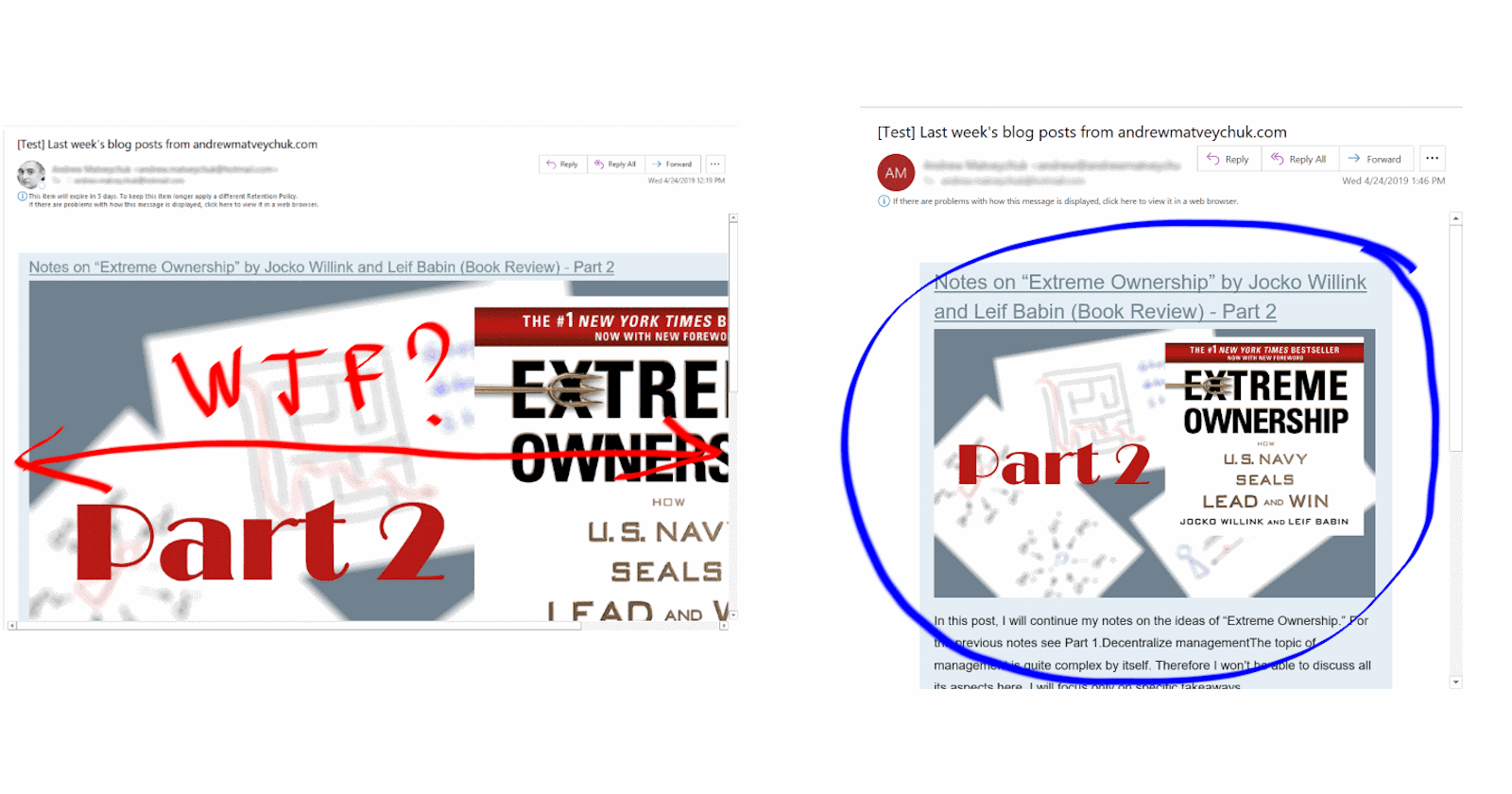
The post’s cover image, which should have been resized to the email template's fixed width, was served in its original size, causing the whole message to be blown up.
Context
As it seems from a technical perspective, both Mailchimp and Ghost have all the required features to build an automated pipeline for sending out emails. Mailchimp service has a useful campaign template that can be used to automatically email updates on the new posts from your blog to your subscribed contacts. This template uses an RSS feed as a source and sends out emails by a defined schedule. Ghost engine has the automatically generated RSS feed for the main post index and the options for RSS customization.
Both parts were properly configured and ready to send a weekly digest of blog updates. Before putting the whole system into production, I decided to perform an end-to-end test to ensure that everything worked as expected. As part of the verification process, a test email was sent to my email address.
The problem
Unfortunately, when I viewed my test email in my desktop Outlook client, the cover image was not resized to the email width and looked like on the screen at the beginning of this post. However, in the web version of Outlook and in Gmail, the same email was rendering correctly without being stretched by the post image.
Investigation
Mailchimp has a feature that resizes the images from the RSS feed to fit the template. Trying to turn it off and on didn’t help. In fact, this feature simply doesn’t work for emails viewed in the desktop version of Outlook.
After some searching and playing with different custom CSS styles in the email template with no positive results I came across the explanation of such strange results on image rendering in Outlook client. As it turned out, the old versions of Outlook clients used Internet Explorer for rendering HTML emails and the newer ones used Word engine to do this job. As a result, the Outlook client just doesn’t recognize such CSS elements as max-width, max-height, and so on that are used for altering the image size in Mailchimp email templates.
The last option was to serve Mailchimp with images of the proper size. Reducing the size of the original images on the web pages was not an option as it would gradually reduce the user experience for the site’s visitors. I had to find a way to transform images from the site’s content to the Mailchimp campaign.
The solution
As I already mentioned, Ghost engine has the options for customizing RSS feeds and they can be used on the site theme level. This means that you don’t have to change anything in the Ghost engine or its configuration itself. You can redefine your default RSS feed or, even better, create a new one without affecting the default just by editing your current theme.
RSS has a module extension – Media RSS, which extends the capability to syndicate different media files in your feed. Moreover, its media:content element has attributes to define the height and width of the media object. So, for example, you can set the image size that will be served over RSS to a subscriber:
<media:content url="{{feature_image}}" medium="image" height="auto" width="560"/>
I created a new template for the RSS feed to be used as a source for the Mailchimp campaign and configured its URL in routes configuration. After this, I changed the RSS feed URL in my campaign to this new address, and, voilà, my new test email was rendering in Outlook client correctly:

P.S. Remember also to add to your Mailchimp email template a CSS style for correct image rendering on mobile devices and other responsive clients so it looks something like this:
\*|RSSITEM:IMAGE|\*